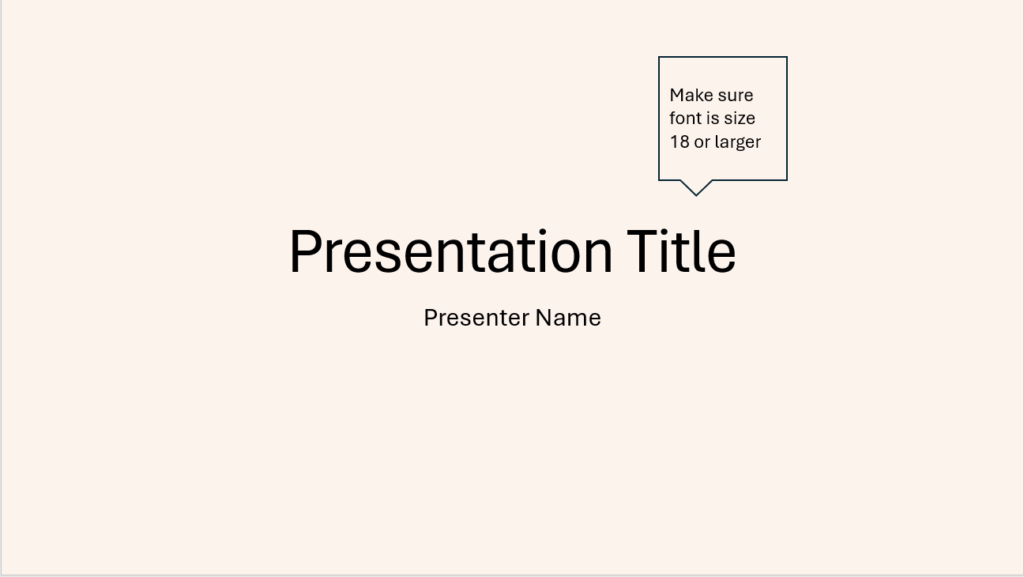
You can make your slides more accessible at your event by making a few simple updates so that they are inclusive for everyone at your event.
Images
- Add Alt text to images and charts to allow all delegates to understand the images and charts fully. If the image is decorative ensure you have ticked this in set up.
- Keep descriptions concise.

Audio Visual
- Make sure that any video or audio clips included in your presentation have subtitles or a transcript is provided to ensure this content is accessible to everyone.
Colour, Style & Text
- Use off-white backgrounds with a dark text.
- Use size 18 fonts or larger. Avoid fonts that are not clear e.g. Italics. Recommended fonts are Calibri, Franklin Gothic Book, Lucida Sans and Segoe UI.
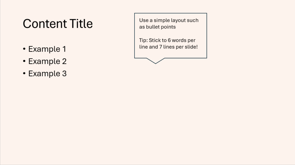
- Use a simple layout e.g. bullets points.
- Make use of headings to distinguish content.
- Make sure your background colour contrasts with your text colour.
- A good tip to follow is using the “6 by 7” rule, which is only having 6 words per line and a maximum of 7 lines per slide.


Slides
- You can use speaker notes to provide further information when sharing slides after your presentation to delegates.
- Sharing your slides in advance can be helpful to neurodiverse people. This can also be particularly helpful to any deaf delegates to enable them to discuss with the interpreter any new words and figure out a sign ahead of the presentation.
These are just a few ways you can make your slides more accessible. Take a deep dive into equality, diversity and inclusion for more helpful tips.

